
Primary colors and shadings
This color system is designed to ensure accessibility, simplicity, and consistency across all corporate communications.

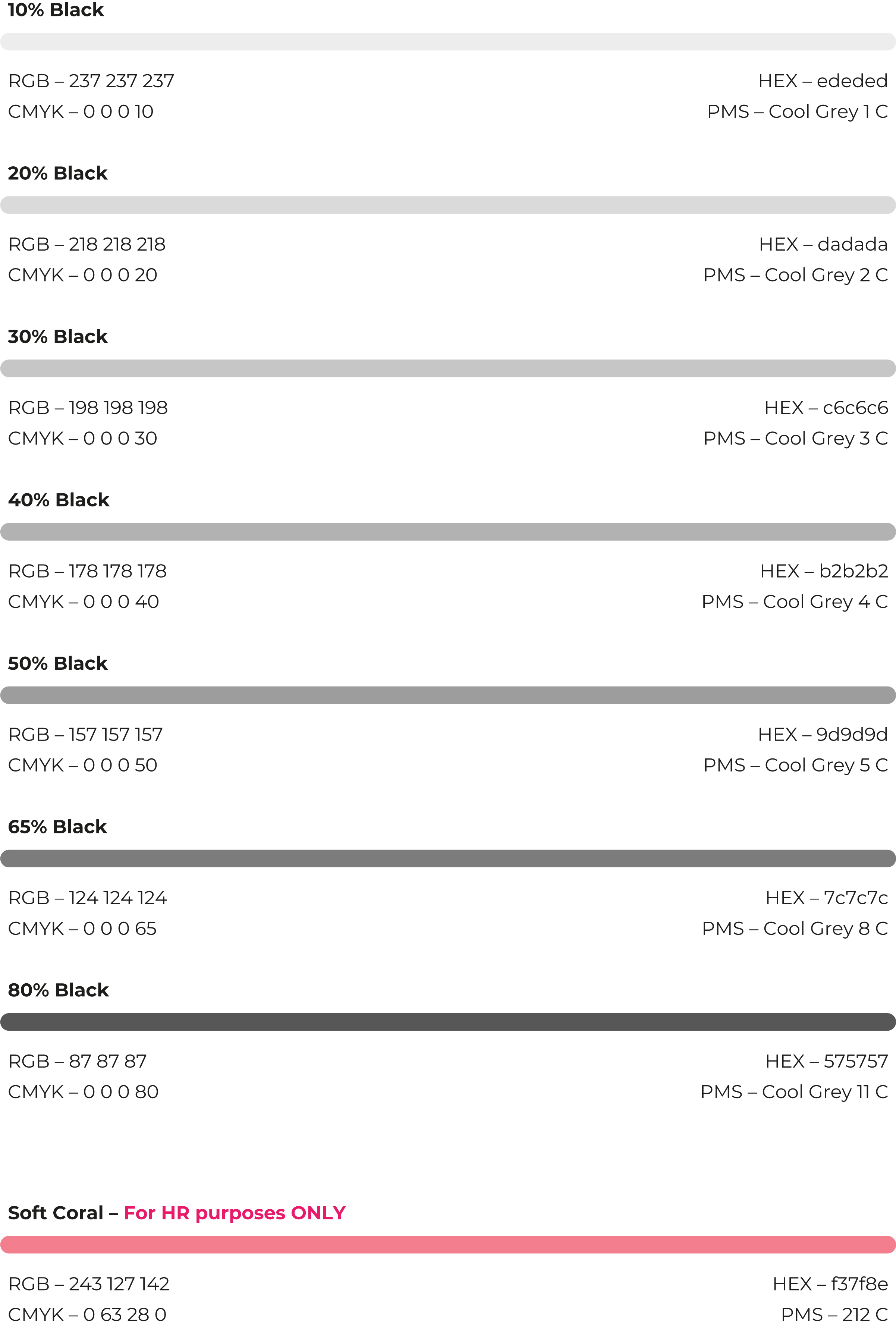
In addition, the color system is complemented by a range of shades.
Our gradients
The gradient from Sphereblue to Black facilitates emotional branding on a large scale. Its use is limited to backgrounds and image overlays.

The orientation of the gradient depends on the composition's dimensions. If the horizontal length (x) exceeds the vertical length (y), the gradient runs from left (Sphereblue) to right (Black).

The gradient from Black to Moonshine Pink is exclusively designated for the "Pink Moon" element. This applies consistently across all compositions and media. The gradient must be applied at an angle of -117°.

Color usage
The color proportions vary depending on the specific communication focus. Different proportions of our colors can be utilized across various materials and communications.

Use these basic rules to get the most out of our colors within our compositions.

Application examples

Dos and Don'ts
